CITY FIRST CHURCH — LOGO & BRANDING
This is a case study of the City First Church logo and color rebrand done in 2015/2016.
“Throughout the years, City First Church has worked with a myriad of graphic designers to develop a range of projects from simple fliers to complex initiatives that would be seen by tens of thousands of people. When it came time to do a complete rebrand of our church, which included a strategic name change, we asked Aaron Campbell to oversee the entire effort. We were more than thrilled with the outcome!”
— Jeremy DeWeerdt Senior Pastor, City First Church

The City First Church rebrand was enormous, complicated and had a lot of factors involved. The total process was many months long and very wide reaching.

The church had rebranded about 7 years previously, and had great name recognition in the community: Rockford First. However, satellite campus expansion was on the horizon, and Rockford First was not a portable name, thus City First Church was born.

The goal was to carry elements of the Rockford First logo into the new mark, and this is primarily seen in the logotype. The ligature between the “r” and “s”, the lower case letters and the square “I” dots are all reminiscent of the previous version. In making the logotype accessible and “friendly”, the type does a great job to give the overall logo and inviting look.

The logo-mark was more tricky. We actually had the cross first, but there wasn’t a consensus that it was enough on it’s own. This became the primary logo later, but there was an alternate logo created that spoke to the heart of the church for each city in which it was situated.

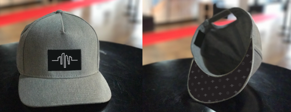
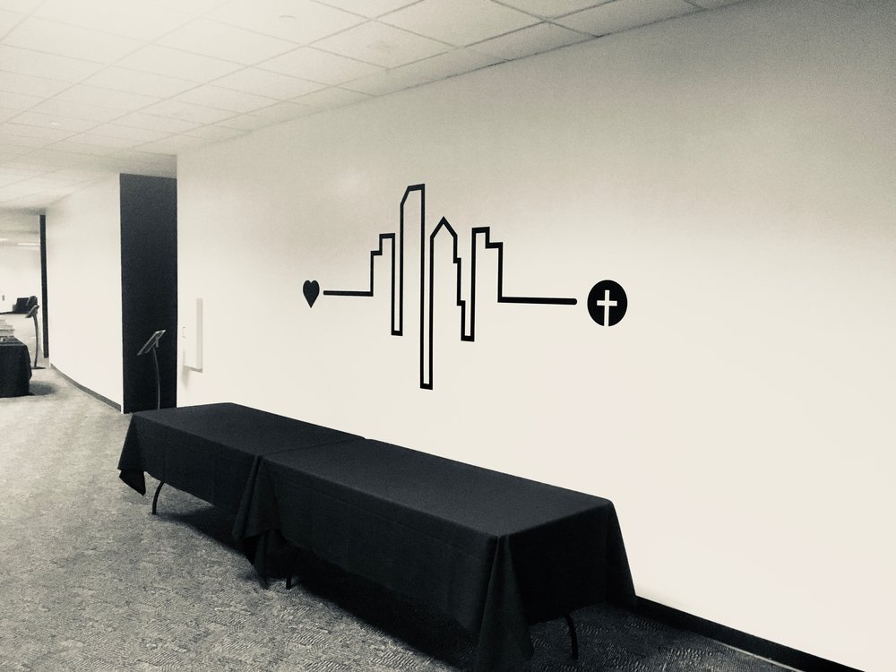
The Heart Line. This showed the city as a heart beat, while also being shaped as a heart. This was one of my favorite pieces, and did well in creating branding elements for apparel, wall graphics and signage around the building.

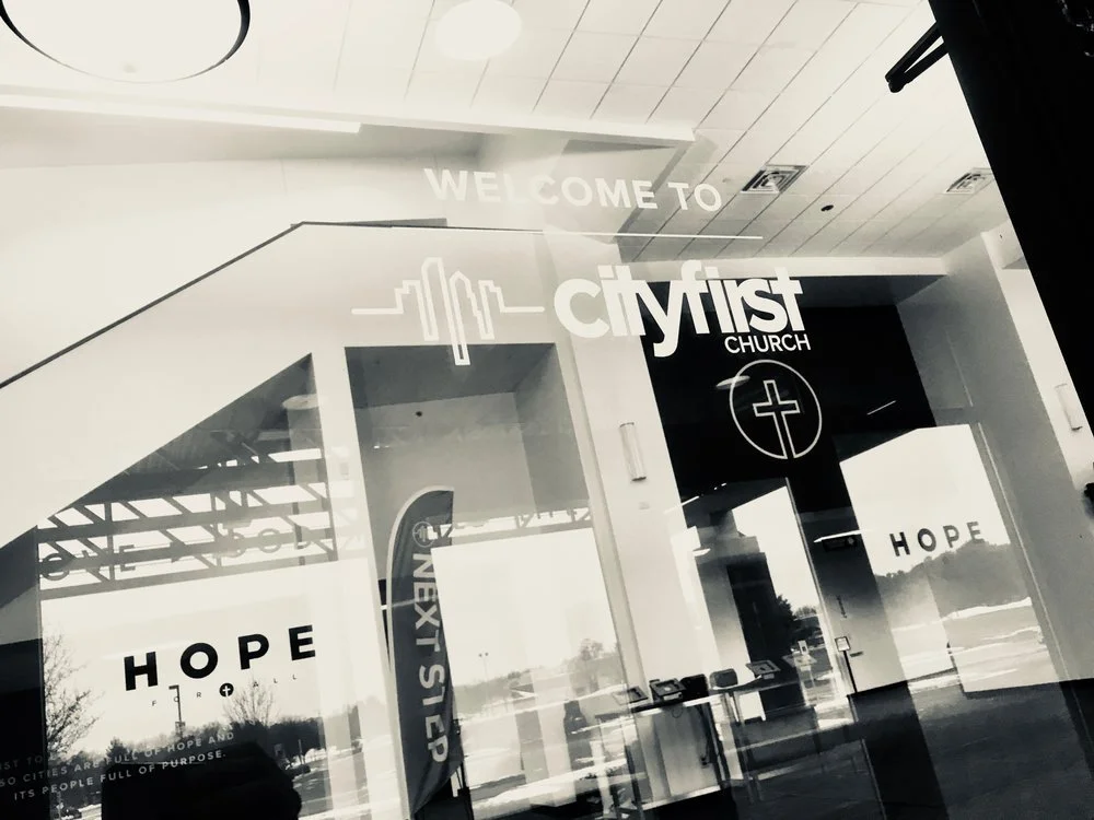
The primary exterior signage, when replaced, was the only place to feature the cross version of the logo, to make it clear the building was a church. However, through everyday usage it worked it’s way into being the primary logo used at all campuses. You can see more of the branding at cityfirst.chuch.

On the left is the initial sketch I made on my iPad of the Heart line logo idea. Below you can see various physical brand aspects that were created in conjunction with the new logo system.